Our Latest Feature: Modern, Luxurious, ECBG
Our favorite cakes featured in Modern Luxury Weddings Magazine
At ECBG we love bringing other people's wedding cake visions to life, but when we get to design, create and build a design from the ground up, that is when we are creatively fulfilled. We are so grateful to be in the Modern Luxury Weddings community. It is filled with so many amazing businesses, people, and vendors that we have been so lucky to form relationships with. Plus they let us dream and play and design, which you know we love! Together with the other incredible cake designers in Chicago, a few times a year, we get to go outside the box, try new things, and challenge ourselves. Myself, and my cake decorator Kristi Caccippio have the best time designing the size, shape, and decor of each and every cake ranging as far back as 2017. Kristi is an incredible sugar artist. She hand sculpted each flower and berry and twig and ruffle you are about to see. She enrobed each and every tier in fondant. She spent so much energy pouring her heart and hands into each design which translates into these sculptural masterpieces! Please enjoy some of our favorite cakes from our Modern Luxury Magazine features!
Photography by Neil John Burger
This cake gives ‘romance at midnight’ which many couples love! We used fondant and ground up wafer paper to create a variety of textures. This cake is perfect for those looking for something unique and moody. A dark base color like this is a perfect way to break the norm while remaining elegant. Many of these cakes feature one of our favorite design elements - sugar flowers. We can create the flowers of your dreams to match your cake vision. Here we added luscious jewel toned flowers and berries to really complete the dark enchanted forest vibes. My favorite element? The sugar mushrooms crawling out from the floral arrangement.
The theme for this cake was citrus, and I think we understood the assignment! I wanted to draw inspiration from the Amalfi Coast in Italy. We brought in bright yellows and greens for a summery feel, and the pattern was inspired by Italian ceramic tiles. We put a modern spin on it with the circular shape and hand made sugar lemons and twigs.
Photography by Collin Pierson
This cake is fun, chic, and clean. It has a smooth white base with fondant pieces covered in different sprinkles. Again, it's all about texture - we love it, and we wanna see it everywhere. This design can be done in different colors to fit any theme, but we love this unique twist on a classic white wedding cake. It would shine in a big bright place like Room 1520, but also be a star in a modern rooftop wedding like at The J. Parker. The movement of this design stands on its own - no flowers needed!
Photography by Neil John Burger
Adding interesting elements to a white cake satiates the needs of someone who wants to stick to a traditional look, while adding a little pizzazz. The theme for this shoot was “Water colors.” Here we started with a white base and painted brush strokes in shades of ivory and rust. Then we added layers of wafer paper to create a chic paper mache vibe. The ripped paper elements add texture and dimension. This cake is elegant but also rustic. It would look amazing in front of a warm wood background, like at Salvage One, but would also fit right in at an extravagant wedding at the Chicago Cultural Center.
Photography by Photos By Brit
The year is 2020 and we are forced to make small cakes. But who says small cakes can’t be exquisite?! With guest counts at 20… sometimes 10 people max, micro weddings are all the rage. If you will. I LOVE this cake. It is a sandy marbled fondant finish with gorgeous handmade sugar orchids. It would feed about 50 people, which is more than plenty for our lil micro weddings!
Photo by Gerber + Scarpelli Photography
The Penthouse Hyde Park had just opened up and their Art Deco vibes were the muse for this shoot. As predicted, The Roaring Twenties were a huge trend around 2020 and we wanted to put a classy understated spin on it. Shades of white and gold mean this cake is neutral enough to work anywhere and with any color palette! My favorite element is the hand cut, hand painted, hand placed edible sequins. THEY ARE INCREDIBLY tedious, but turn out so delicate and beautiful. They are an impressive nod to fashion from the 1920’s and the geometric lines are a nod to the architecture of the time period.
Photos by Gerber + Scarpelli Photography
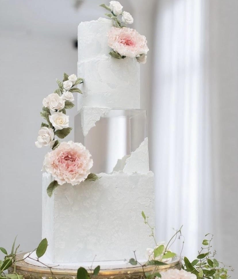
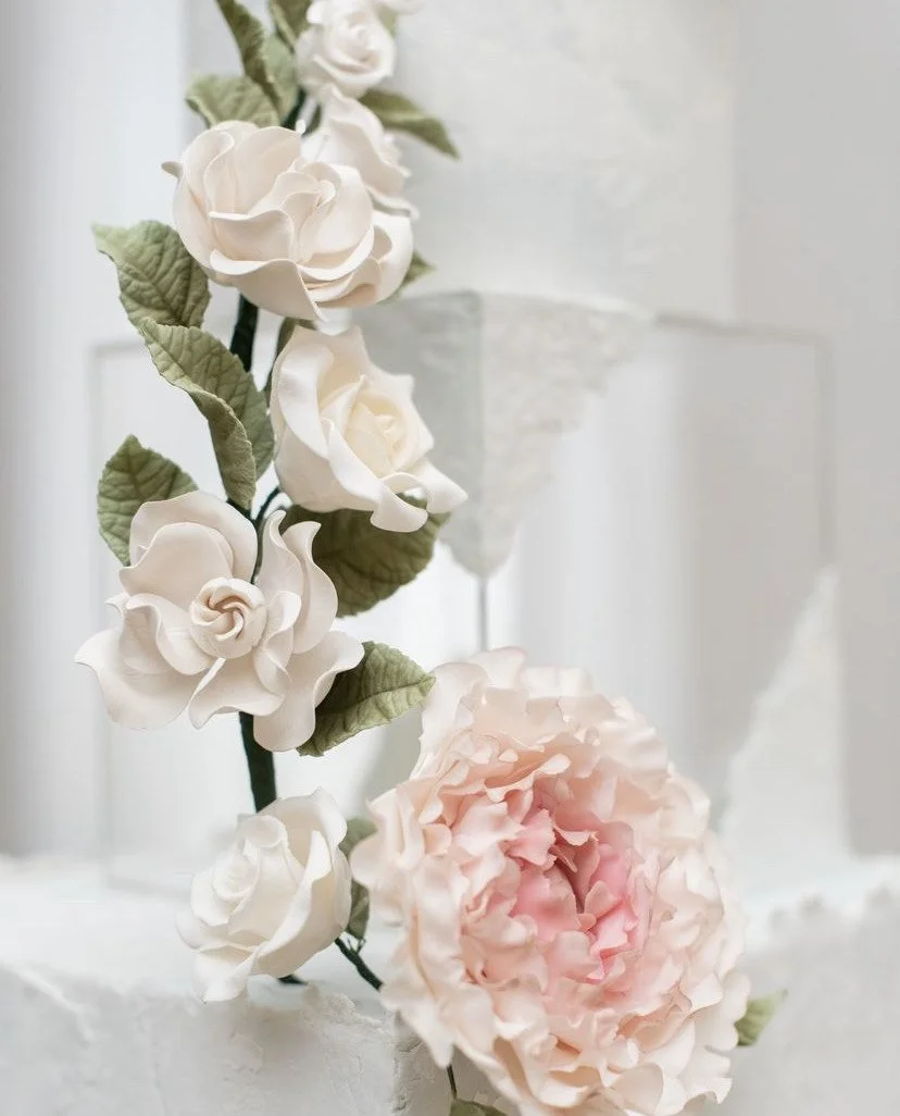
This cake is the marriage of ancient and modern times. The fondant texture on the tiers is what we call ‘stonework.’ We combine different textures of fondant and roll it out to create this incredible cracked stone finish. We add hand made fondant peonies and delicate small flowers to romanticize the design. The addition of the lucite riser adds a modern flare to the appearance. It adds height without adding cake or weight, which is perfect if you want a larger spectacle but perhaps less cake, for some strange reason…
The classic but contemporary aesthetic would be complemented by the natural light at the Swissôtel, or the architecture at The Chicago History Museum. This would be perfect for a couple that's into history and/or fairy tales. Are you the happy ending version of Romeo and Juliet? This cake is perfect for you.
Photos by Gerber + Scarpelli Photography
This cake is fun and flirty. Another classic white cake with a twist. Our prompt was wedding cakes inspired by wedding dress fabric and fashion. We used an edible thin film similar to rice paper to create the frilly tulle-like texture. It says ball gown, tutu, and flamenco dancer. It says princess dress with a huge skirt or modern ruffles with exposed boning. It moves around the cake like a dress would on the dance floor. This is perfect for an adventurous couple that wants to keep the cake white, but go outside the norm. Another great example of a cake that stands completely on its own without florals. This one would look amazing against the backdrop of Cafe Brauer but would also look gorgeous at Galleria Marchetti amongst lots of greens.
Photography by Gerber + Scarpelli Photography
This is another fondant stonework cake, but with a little more whimsy. The theme of this shoot was BOLD colored monochrome. Monochromatic cakes have a gorgeous simplicity and it's always an opportunity to go tastefully over the top. Purple is an underrated, underutilized, and gorgeous color, especially for weddings. We hand made these sugar flowers to match perfectly. I think they also add a sense of magic, as if the flowers are growing from the stone. This is another cake that would be great for a couple that loves a sense of wonder and a pop of color. She's truly a chameleon, she would look fabulous at an extravagant venue with pronounced architecture, but would also look amazing at an outdoor or botanical setting.
Photographed by Nick Gerber and Belen Aquino, Gerber + Scarpelli Weddings @gerberscarpelliwedding
Props and Styling by Taylor & Co. Event Design @taylorandcoevents
Editorial by Elle Cashin, Modern Luxury Weddings @modluxweddingschi
With this design we wanted to bring in ancient architecture and the idea of growth from rubble. The intricate magenta details in the hand made sugar flowers are a great contrast to the hyper realistic gray stone texture. The pillars really transport you and make the cake seem fragile and impressive. It's sturdy but gives the illusion that it is weathered and crumbling with age. The flowers, growing and emerging from the destruction represent perseverance and new life against all odds. It’s a statement piece, and would be perfect for a couple who want to give their guests something to gawk at. Perhaps a couple who loves ancient architecture and the contrast of old and new. Something like this would obviously be incredible at The Field Museum.
It is always an honor to be among the best cake decorators in Chicago featured in Modern Luxury Weddings. These artists and companies have always been inspiring and aspirational for me. Now to be their peer is the honor of my life. We love the challenge of coming up with new and different designs and elements and we are always BEAMING to see it come to life in print.


